How to avoid the pitfalls of rebranding, should you find yourself in the position of needing to do a rebrand.
There is a fine art to rebranding, get it wrong and your consumers will lash out (Gap) get it right and you could be one of the best selling brands from the UK (Burberry).
First ask yourself, why am I rebranding? There are only a few reasons why rebranding maybe a good idea, and here are a few:
- Your brand no longer matches your values. How you are perceived may be very different from the values you are trying to emulate and their is a disjoint in your communication.
- You have added a new service or product and the brand needs to realign itself.
- You set up your business on the cheap (DIY) and you need to create a consistent feel across all touch points now that you are fully established.
- Your brand image isn't keeping up with the times and is a little dated.
- A competitor has come onto the market and you wish to make more of a differentiation between you.
Secondly, let me also say that a rebrand is much more than a redesign of the logo. You could have a complete rebrand and not touch your logo at all. A brand includes everything from your touch points, your strategy and your communications. Your brand is how you are perceived. All three of those can be revamped whilst the logo resides untouched. Also a rebrand can be just a tweak to the logo, colours and fonts, it doesn't have to be something completely new. And a redesign of the logo does not necessarily mean a rise in turnover and profits, so if you're thinking a redesign will win you more work, it might do initially but in the long run if you haven't taken a long hard look at all areas of your business you could be in for a disappointment.
I also think, especially in light of Gap and Tropicana's rebrand, it is worth involving your audience. Bring them along for the journey they are as much a part of your brand as the logo is. After all they are the ones carrying the emblem around on their bags, cups, clothes.
Lastly, don't underestimate the worth of your brand. Gap's audience clearly felt very attached to the existing logo and were not pleased with the change. Their voices forced Gap to go back to the original logo. That would have been an expensive lesson.
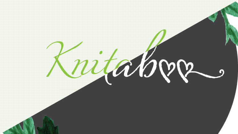
Recently I rebranded Knitaboo. Four and a half years ago I designed the original look and feel and whilst is has served them well, it was time to realign the values and bring out something that stood out from the ever crowding market. The end result - a more modern eye catching suite of material that builds upon the existing foundation. I redesigned the logo, the supporting graphics and produced a suite of online avatars and banners, plus marketing material. I took great delight in designing a bespoke gift wrap for Knitaboo to be able to wrap up their orders in a unique way.
N.B all updates to Knitaboo online have been done by the client.
Related posts:
Published by: Rachel Ganeshwaran in Branding, Business strategy

