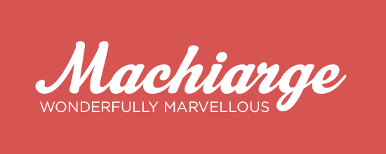
Machiarge is best used as a title font. It wouldn't be so easy to read as body text but makes for a wonder introductions to any magazine spread, especially when paired with Gotham. I have used this for logos and editorial spreads alike and am never disappointed. If you are looking for a more slender font Cider would be a good choice. You can buy Machiarge at myfonts.com
Related posts:
Published by: Rachel Ganeshwaran in Branding, Magazine, Typography
