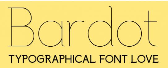
It can be used as a header font and equally as an elegant paragraph font. "Graceful, curvaceous and attention seeking, Bardot offers elegance and charm in abundance." This is definitely a font of choice. And I have enjoyed using it on a recent packaging project.Read more...
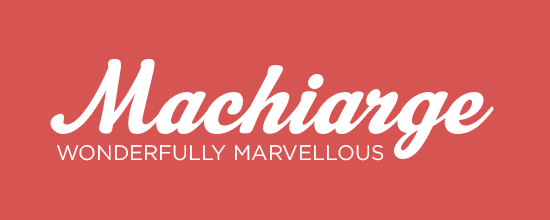
Machiarge is best used as a title font. It wouldn't be so easy to read as body text but makes for a wonder introductions to any magazine spread, especially when paired with Gotham. I have used this for logos and editorial spreads alike and am never disappointed. Read more...
First let me say that you usually need a license to us a font (or even have it on your computer). There are a selection of free fonts you can download from dafont.com with the option to 'donate to author'. It is always a good idea to honour the creator. Read more...