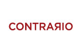


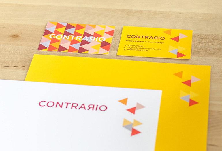
CONTRARIO
Contrario is an end to end IT solutions company. They work with large businesses to streamline their IT systems. They cut through the "crap" and get on with the job in hand to allow businesses to run efficiently and effectively. Contrario has a two pronged approach; they develop and deploy IT solutions and they manage and maintain the newly developed system. Ideally they would like to outsource the management to a reputable and capable department. They aim to educate their clients on how to approach IT problems and how to manage the deployment and maintenance of the solutions. Top of their priority list is ‘de-mystifying IT’.
Contrario means to think differently, to do the opposite. And so the simple yet effective solution was to reflect the'r' to be the opposite; representing the meaning in the word. Directional arrows were used as complimentary graphics to reinforce the meaning. Bold colours were used to draw attention and to reflect a bright future ahead for delivering IT solutions.
We delivered: the logo (from print to screen to social media use), complimentary fonts, colour palette, photography style, brand guidelines, stationery, PPT, and website graphics.